I have posted previously about my Transformation in Data Visualisation and without that paradigm shift, I believe I would not be adding as much value to clients as I do now. This post is about the next step on the journey for me. I believe a lot of you are in the same boat, so the message of this post is aimed at helping you along, as we are in this together.
I am a very visual person, from learning style to my photography hobby, to how I see the world. So for years when I was writing reports, I was actually out of my comfort zone. Then when exploring Garr Reynold’s Presentation Zen (http://www.presentationzen.com/), the works of Edward Tufte (http://www.edwardtufte.com/tufte/), participating in Stephanie Evergreen’s data visualization workshop (http://stephanieevergreen.com), and reading the works of various other data visualisation bloggers, I realized that most people are out of their comfort zone when reading text, and visualisation of key messages, whether they be qualitative or quantitative, enhances the reader’s ability to internalize the information. Let’s face it folks, most people prefer pictures to text!
While many of my clients still request a full-bore (pun-intended) report, I have tried to introduce visuals and graphics wherever I feel the report needs them. I like to insert graphics into section heads to help guide the reader through a long report. I also like to use the rule of thirds or quarters to divide the page into balanced areas for text and graphics. My previous post on Data Visualization shows my very early, yet client-endorsed, attempts to do this.
I am in no way an expert in data visualization; I am like most of you reading this, just someone who sees the need to present information more graphically, and is learning how to do so. So based on the sources above, and those of some other cool openly-available sources like Piktograph (www.piktograph.com) here’s some of the key pointers I consider I make when I want to visualize information:
-
- Make sure the sizzle doesn’t out-perform the steak: In the end, the key message(s) is/are always the most important, not the cool pictures.
- Show more than tell: Text is important in a data visualization but should be used as a supplement.
- Keep the message(s) simple: Don’t try to accomplish too much in a single data visualization.
- Tell a story or have a natural flow to the visual: The reader should progress through the visual and understand the story you are trying to tell.
- The data must be credible and verified: There’s no point in going to all this trouble if the data are not reliable.
- Know who your audience is: Your design is most compelling to folks who can best relate to the story you are trying to tell.
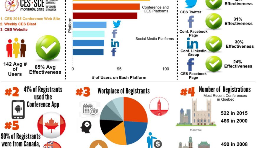
Above is an example of an infographic a type of data visualization, I was asked to build for the Canadian Evaluation Society. The message or story is a summary of key facts from their most recent National Conference. It is aimed at their membership, so evaluators, and specifically those who are organizing the upcoming conferences in 2016 and 2017.
The infographic flows using a grid system: vertically in four sections and horizontally in three sections. Each vertical section gets at a finer grain of the data and thus finer tune to the message:
-
- The first level is an overview, including an “eye-catching” title (insert smirk here);
- level two summarizes the use and perceived effectiveness of various promotional media;
- the third level include tidbits about the conference registrants; and
- level four presents facts about the actual conference activities, culminating in its overall approval rating by attendees.
Hey, this is far from the be all and end all of creating infographics! But, it is an example of how a guy who’s core skills are not in data visualization is able to convey a one-page message from a much larger source document, and do so fairly easily following some simple guidelines.