
As a trained educator, I certainly see the intrinsic value in continuous learning. As an entrepreneur and practitioner in an evolving field, continuous learning through professional development (PD) is not only essential to survival; it offers opportunity for competitive advantage. I regularly participate in PD courses at industry conferences, looking to stay sharp and get on the leading edge.
A while back at the American Evaluation Association annual conference, I enrolled in the highly sought after Presenting Data Effectively two-day workshop conducted by Stephanie Evergreen. I had purchased her book of the same name, and figured the workshop would be a good way to familiarize myself with the concepts. Before the conference and workshop, Stephanie suggested we bring a report or presentation to work with. An actual working workshop certainly appealed to me! I was going to take full advantage of this opportunity, and I had just the type of report in mind.
I produce a series of reports every year for a client organization that is national in scale and associated with a very conservative profession. They hire me to analyze and present their data from performance assessments from thousands of their members each year. They pay for my expertise, developed through a combination of my formal graduate education and experience within the specific field of psychometrics. They introduce me to the external regulators of the profession as their psychometrician helping them make sense of their data. Psychometricians are supposed to be boring, number-crunchers right? Well, my original reports to my client, certainly delivered the analytic information, made sense of it, and provided recommendations based on it. My original reports, though, were boring, and they were difficult to read for the untrained eye.
My client, the governing body of a prestigious profession; the client I have served the longest, never once complained about my reports. But, I knew I could do better. I knew there had to be a better way to present the mounds of data I help them make sense of; but how? Well, in steps Stephanie Evergreen.
During her workshop, ideas she presented and demonstrated showed me concretely how I could improve my reports, to be informative and readable, and to be visually appealing. I worked during the workshop at the prescribed times, and took notes, scribbling and sketching ideas. After the first day, I spent a few hours in my hotel room working on a re-design of my reports, front to back. The next day, it was more of the same, but with some different ideas. By the end of my time at the conference, I basically had the re-design completed. The workshop was well worth the time and effort from my perspective. But the ultimate proof would be in the pudding. What would my client think?
When I sent my first re-designed report to my client, I was hopeful for positive feedback, but prepared for some push back. Well, the feedback was indeed positive! I received comments that the new format was “easier to read,” “more visually-appealing,” and catered to those who wanted to access key information quickly. The new format became the preferred format.
Stephanie’s ideas for page layout, font choices, use of colours, images, Infographics, and dashboards were tried and certainly passed the test. I have included some before and after photos just to illustrate how far I was able to take my reports after just two days of a workshop, and about a day of tinkering. The workshop was absolutely the best one I have taken in a very long time, and it continues to pay dividends in expanding my repertoire of methods to present data effectively.
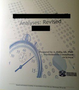
Report Cover Before

Report Cover After
Text Page Before
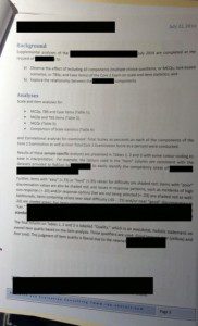
Text Page After
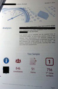
Dashboard (New)

For Data Visualization enthusiasts, I highly recommend Stephanie’s books.